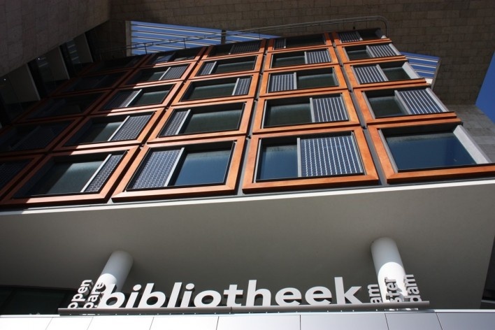
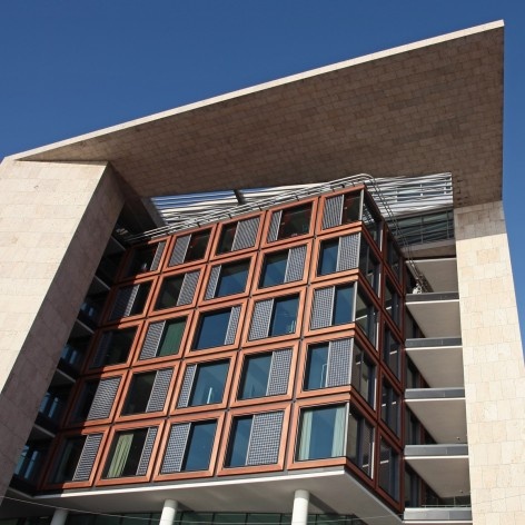
The Openbare Bibliotheek Amsterdam (Amsterdam Public Library) on Oosterdokseiland is a hallmark in the oeuvre of Jo Coenen, architect. Together with the slender Vesteda Tower in the centre of Eindhoven and the Markt-Maas project in the centre of Maastricht, consisting of elegant blocks of stores, apartments, offices and a new council chamber, the Openbare Bibliotheek Amsterdam (OBA) can be seen as the rich harvest of large-scale constructions yielded by the firm of Jo Coenen & Co in the first decade of the twenty-first century.
Film by Helena Guerra
The Vesteda Toren in Eindhoven, the Markt-Maas in Maastricht and the Openbare Bibliotheek Amsterdam have more in common than their volume, their significance for the respective cities and the fact that they were built at the same point in time. All three projects are based on related motives, best illustrated by featuring the library in a leading role.

Public Library Amsterdam, Netherlands. Jo Coenen & Co Architekten. 2007
foto Arjen Schmitz
Assignment
“To unite the grown apart world of books, which represent many centuries of culture, and the assignment to create a library of experience?”
The design of a library is an assignment par excellence, which is primarily not focused on the creation of an exterior composition, a compilation of facades, but which is especially focused on designing the inner world.
“Building and interior are indissoluble interdependent”
This is one of the reasons why the architect preferred to design as well the interior as the exterior. In this library exterior and interior are indissoluble unified. The assignment is a piled up program of 28,500 m2in an urban envelope with a volume of about 40 meters height, 40 meters width and a length of 120 meters.

Public Library Amsterdam, Netherlands. Jo Coenen & Co Architekten. 2007
foto divulgação
From urban planning to building, a from-the-inside sculpture
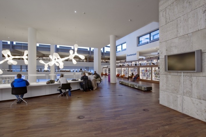
The design of a public library with these measurements, within a binding urban plan, was only possible by looking through the eyes of a sculptor. The building is grated and sharpened like a stone monolith to make sure that the inner life will be as comfortable as possible. At some places, the building is set back from the prescribed urban borders. As a result of this, an inner space existed which creates natural light in the interior space. Despite of the immense program of the building, which was ought to be met, it was possible to create a diverge building with multiple shaped sub volumes where as well intimacy as overview and orientation can come together. The exterior is, in a way of speaking, thought out from the inside. The main goal was “to create spots”, which come to live and will develop a value which makes you decide to stay, supported by light, space and color. By the diversity of activities, a joint play of these spots is crucial. The building is supposed to be accessible and open in every fiber. Different spots with unique atmospheres make the visitors affectionate to the building.

Public Library Amsterdam, Netherlands. Jo Coenen & Co Architekten. 2007
foto divulgação
Manifest for architecture
Also the contemplative is an important aspect of the interior of the library. This sentence is also considered as a manifest of architecture in general. It is a response to the increasing tendency to snazzy, overweening and briefness in architecture. For public buildings and especially for buildings where books are preserved, which represent our cultural body of thought of many centuries, applies that they should be treated with respect. This is translated in quality and discretion.
Contrast
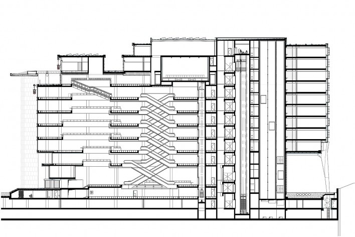
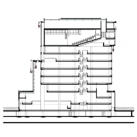
The contrast between different atmospheres can be found in the composition of the building, as well the interior as the exterior. The building consists of a base plinth, middle and top.
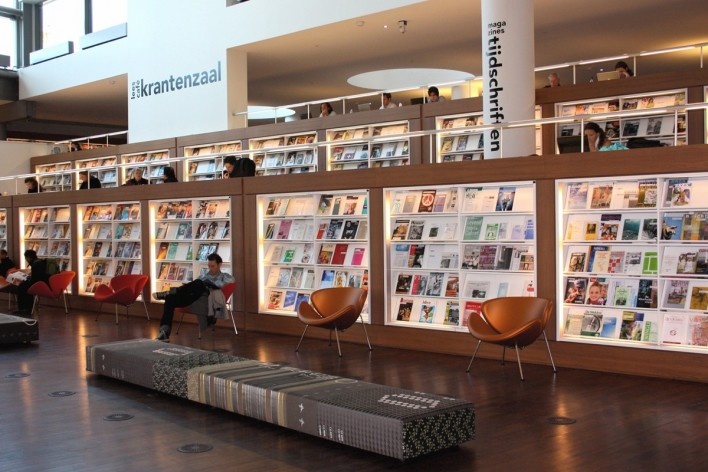
The “base plinth” represents the fast and briefness and has an urban and public character, while the “middle” – where the books are preserved – symbolizes rest. The “top”, where the theatre and restaurant are found, is the place where people meet, relax and interact or discuss. The top also has a public character like the base plinth.

Public Library Amsterdam, Netherlands. Jo Coenen & Co Architekten. 2007
foto Arjen Schmitz
The term “experiencing library” is translated to “identification by character”. By art, interior and light, accents were added which caused the building to create its own character. The interpretation of “experience” gets a unique content this way. This made it possible to unite the grown apart world of culture and assignment.
Movement
Movement is crucial to the way architecture is experienced by the senses. The perception of the materials used, the details, the scale, the contrast between light and dark, open versus closed, are all heightened by movements within the structure. The architecture of a building can structure these movements, direct them and accompany them by a variety of fast and slow tempi, of staccato movements alternated with sustained ones, by breathing spaces and differences in rhythm.

Public Library Amsterdam, Netherlands. Jo Coenen & Co Architekten. 2007
foto Arjen Schmitz
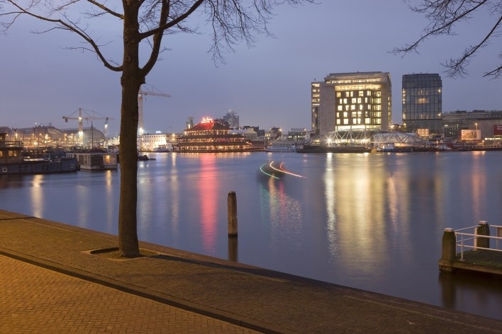
The route from the Central Station to the OBA runs along the curved side of Oosterdokseiland. The building is heralded by a passage way to the entrance made of natural stone, prompting visitors to take a left turn.
From the landing, one is offered a view into the heart of the building. To the right of the landing is a lively square, an area where people can meet and relax, protected from the elements by the huge canopy.
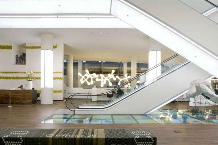
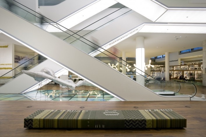
The entrance hall is a low-ceilinged area, a transition to the next repertoire of movements, via a high-ceilinged hall, to the main lobby with an enormous area to the left, where one can easily and gradually descend. Straight ahead are the escalators offering an organized ascent of staccato movements. To the right are several terraces providing indirect access to the exhibition area and to the multimedia section of the library somewhat further on the intermediate floor.

Public Library Amsterdam, Netherlands. Jo Coenen & Co Architekten. 2007
foto divulgação
Via the escalators a repetition of movements then follows that are continually different because of the way the voids are situated. The penultimate floor is different, in the sense that it is an announcement of things to come. Via the wide stairs it opens out onto the top floor under the canopy offering a wide telescopic view of Amsterdam.
The architecture of the library as a whole is also, figuratively speaking, in motion. By extricating itself from the base, abandoning the alignments with a concave and a convex facade, rotating, receding, projecting and in doing so – insofar as this is possible within the situation at hand – breaking loose from its own boundaries, it reinforces the effect of the different movements that visitors of the building can experience.

Public Library Amsterdam, Netherlands. Jo Coenen & Co Architekten. 2007
foto Arjen Schmitz
Construction and technique
In architecture, all decisions pertaining to the design of a building affect numerous aspects of its construction. Form, function and technique are inextricably linked. The sharply projecting canopy and the hanging construction of the side wall are two of the Public Library’s components that exemplify how both formal and functional considerations had far-reaching consequences for its construction.
In order to achieve flexibility and a clear arrangement of the extensive and complex Public Library building, only a limited number of columns were used and all spaces were left as open as possible, without any obstacles. Fire safety regulations were met by cleverly situating the different escape routes and by installing a sprinkler system throughout the building. By so doing, the floors did not need to be compartmentalized.

Public Library Amsterdam, Netherlands. Jo Coenen & Co Architekten. 2007
foto Arjen Schmitz
The air conditioning was ingeniously solved by having the voids function as shafts so that there was no need to install any additional pipes or air ducts. All the electrics were installed within a raised floor. In this way, practically everything that could possibly distract the eye from the architectonic form or space was hidden from view.
Because of its unpartitioned floors, the library can easily be adapted to other lay-outs, if required. The present partition between the library and the office building behind it can also easily be removed. Finally, all rooftops are equipped with solar cells, as part of a pilot project for durable energy.
Materials

Public Library Amsterdam, Netherlands. Jo Coenen & Co Architekten. 2007
foto Arjen Schmitz
Natural stone has been used for the construction of public buildings and public areas in European cities from time immemorial. With this material, it is possible to achieve a highly sophisticated detailing, while at the same time heightening the effect of long outlines. Throughout the centuries, the application of natural stone for floors, walls, domes and arches, both on the inside and on the outside, has always been common.
Jo Coenen has a greater affinity for natural stone than for bricks – a preference he developed while working on the Céramique project in Maastricht – and simply hates synthetic materials. Owing to its warm greyish-brown colour, shell limestone, which is frequently employed in Maastricht, harmonizes well with both concrete and wood.
Natural stone accentuates the durable aspect of architecture and affords it a certain elegance. It also ages nicely and when thresholds and stairs become worn, this only serves to enhance the building.

Public Library Amsterdam, Netherlands. Jo Coenen & Co Architekten. 2007
foto Arjen Schmitz
Cladding a building with natural stone can produce a potent sculptural effect, making it appear to be made of one piece. The sole use of this material enables the Public Library to maintain its independence within the ensemble of which it is part, whilst also linking it to the natural stone facades of what used to be the Central Station Post Office.
Natural stone is an exceptionally durable material. Because it is only marginally used in the Netherlands, it reinforces the distinction of the buildings where it is applied and in this particular case underlines the special importance of the library as a public building.

Public Library Amsterdam, Netherlands. Jo Coenen & Co Architekten. 2007
foto Arjen Schmitz
Light
In architecture, light is a factor of great importance to guarantee the correct functioning and use of a building.
Light, particularly natural light, may vary considerably. In the case of a building the size of the Public Library, with a surface area the size of a soccer field and partially boxed in, bringing natural light into the building was no small task.

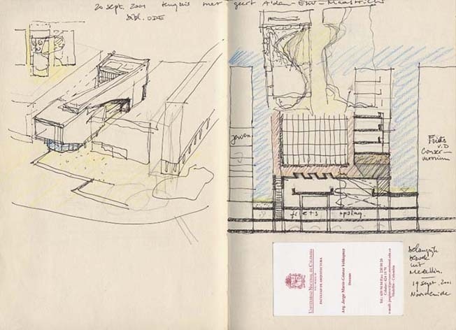
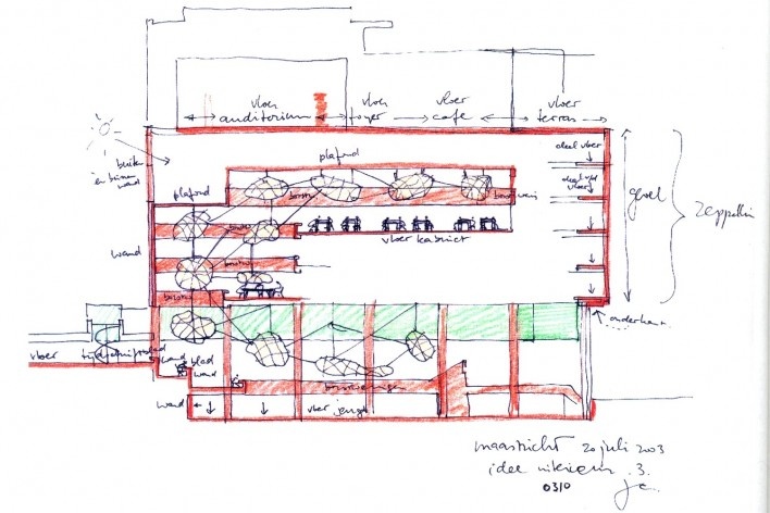
Sketch
divulgação
Jo Coenen went to great lengths to have day light penetrate the heart of the building or to provide natural light vistas where the former was not possible, for example at the rear of the building, where the adjacent office building was detached from the OBA through an incision in the architectural mass. By curving the side walls of the library, the light at the concave side penetrates deeper into the building and the convex side functions as a bay window. The voids and the openings in the floors also allow day light into the building. The escalators, which also serve as light object, provide a brightly lit point of orientation in the heart of the building which is inaccessible to day light.

Floorplan level 0
divulgação
Pleasant spots
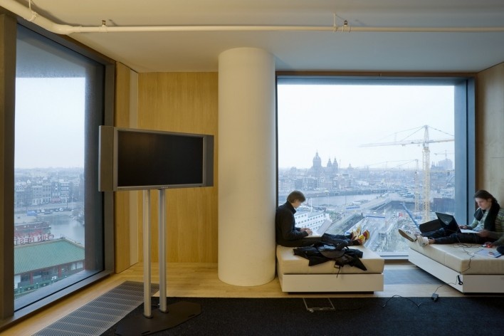
Buildings, especially the larger ones, all deserve to have a certain number of pleasant spots: parts of the building which may not be functional in the literal sense of the word, but are nevertheless essential for the architecture to function well. These can also be found at the Public Library, starting at the square in front of the building: an attractive area for relaxation, meeting up with friends and making contact with other visitors. The large open space outside to the left of the building and the carefully executed ‘ladder’ running from the outside through to the inside, are also pleasant spots for diversion. The same applies to the bay windows where one can look out into the distance in two different directions away from the adjacent buildings, the tranquil areas between the bookcases, the terrace and the area surrounding the theatre on the top floor, all spots where additional qualities are offered by the library’s architecture.

Floorplan level 2
divulgação
notes
NE1
Helena attended the Mediatour Building and Design, from 15 to 20th April 2012, she visited architectural and urban projects in some Dutch cities. The event was organized by the Ministry of Economic Affairs, Agriculture and Innovation and Sara M. Cohen, head of the department for Political Affairs, Public Diplomacy and Culture of the Dutch Embassy in Brasilia, has invited the Vitruvius portal.
NE2
Nina Dalla Bernardina, attends FAU Mackenzie, she is responsible for the special edition of Projects review about the Netherlands. Patrícia Oliveira Lima, architecture student at Senac, collaborated in editing. Both are interns in Vitruvius portal.
Credits
Location
Amsterdam, Netherlands
Date
June 2007
Built area
28.500 m2 (library, theater, restaurant, café)
Project
Jo Coenen & Co Architekten
Arch. Jo Coenen
Design team
Jo Coenen, Geert Coenen, Iwert Bernakiewicz, Max Bachinov, Gerard Extra, Hans Schoot, Will Stokkermans, Bart Erens, Frans Wesseling (exterior)
Jo Coenen, Margriet de Zwart, Wil Ummels, Miriam Boot, Annebregje Snijders, Michela Barone, Ingrid Annokkee, Neeltje ten Westenend, Claudy Jongstra, Martijn Sandberg, NAT-architecten, Peter van Kempen, Gerard Extra, Will Stokkermans (interior)
Models and Presentations
Bas Grimbergen, Changiz Tehrani, Hans Simons, Victor Schmidt, Hans Fransen, Cees van Griessen (Ciiid)
Client
The Amsterdam City Council


