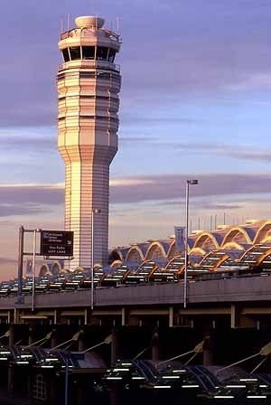
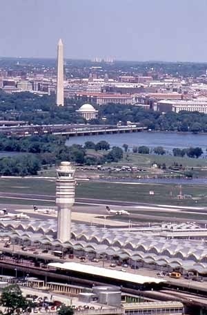
In 1991, the American journal Architectural Record devoted an entire issue to preservation, updating and presenting what would be the country's great inventory of early and mid-20th-century architecture. The works were listed under three main categories. The first centered on those structures that carried on the old sense of preservation; that is, they involved restoration strategies that placed greater emphasis on archaeological research than on adaptive concerns. A second grouping was geared toward renovations that completely altered uses, such as hospitals turned into low-cost housing or houses converted to academic uses. The third category, reflected most in adaptive-use projects through expansions and modifications, illustrated the kind of project that is the focus of this essay – the new Washington National Airport (WNA) (1). The study of the renovation of airports reveals a distinctly new appreciation for a building type and architectonical program that, invented in this century, became obsolete over time, and underwent major transformations. This is well reflected in the terminology dealing with the subject. It reveals a story of change in which the airport is seen as an "old body," an "aging facility" that needs a "new life," an "uplifting" operation. The aging of the structures gives us the opportunity for a critical evaluation that sheds light on contemporary conceptions on the theme and its relation to urban space.
The invention of the airport
At the beginning of this century, airports made architects recognize that there was a brand new opportunity for creative thinking, since the demands associated with airport construction had never been presented before. As an example, in 1928, a national contest for airport design sponsored by the Lehigh Portland Cement Company of Allentown, Pennsylvania, showed that architects seldom attempted to impose conventional forms upon the new building types. In this sense, both the winning project, with its Art Deco terminal and a project receiving honorable mention, which portrayed a runway at the top of its buildings, are examples of the rich spectrum of creativity that characterized the period. Flying became a metaphor for modern times. As the 20th-century mode of transportation par excellence, it came to represent the contemporary ideal of an age, i.e., an airport design would contain its spirit, an idea of the future in a form that followed the best technology. It also proved that the design of airfields was much more than a question of runways. It also was a question of the connections between the airfield with its buildings and the urban environment. Very little has been written on the history of airports and its links with the city, the country, and the world.
The first half of the century witnessed general public acceptance of the airplane as a regular means of transportation, a major weapon of national defense, and a means of sport and recreation, all of which had a decided effect on people's habits, homes, business, and national life. The aviation industry developed at an accelerated pace after the beginning of World War II.
In the 1950s, London’s Hearthrow Airport (1950-1969), the first international terminal in the world, designed by Sir Frederick Gibberd (1908-1984), followed what was at the time the common practice of mixing departing and arriving passengers in one large concourse. By the early 1970s, however, it become apparent that terminals would have to be either rebuilt or greatly altered if they were to handle the enormous growth in passenger traffic. During rebuilding, passengers could be lost to other airports. In this sense, to carry out a phased conversion of the existing building, while maintaining the capacity of the terminal throughout the operation, became the great challenge and demand. Such a demand brought new directions in airport design and construction insofar as they had to deal with large expansions and limited sites. Basic renovation came to mean expansion and reconstruction in a small site, superimposed functions, and re-use techniques.
The WNA reform project was part of an encompassing multibillion-dollar federal program approved in 1996 (whose roots went back to a 1948 plan) devoted to the improvement and development of facilities for American air transportation – including among other areas, the Washington D.C. region (2).
Washington National Airport in the 1930s and 1940s and Its "original" historical design: a great public park
In the 1930s, the official airport for Washington D.C., the Washington-Hoover airport or Hoover Field, was located on too-valuable real estate (where the Pentagon is today) and had to move. In September 1936, President Franklin D. Roosevelt laid the cornerstone for the main terminal on Gravelly Point. Built as part of Roosevelt's Works Progress Administration (WPA), the WNA became a rare and quite beautiful example of the mid-1930s U.S. airport design.
The original WNA was a Civil Aeronautics Authority (CAA) project begun in November 1938. The consulting architect directly responsible for the planning and design was Howard Lovewell Cheney. The goal was to build "the finest metropolitan air terminal in the world, considered both technically and aesthetically" (3). It was to be conceived as a space for passengers, visitors, and sightseers. In this sense, the WNA became one of the first projects in which specialists in "land use design" worked collaboratively with architects and engineers in the adaptation of the site to its intended function. Accordingly, the airport was conceived as a service to the nation's capital and as a model for what other such terminals might be. The whole area was to become "a great public park" (4).
The terminal
The building was already planned so as to permit expansion both horizontally and vertically with a minimum of change and disturbance to the first units constructed. The main features of the original art-deco building presented symbols of aviation in windows and doorways, curved stainless steel staircases, a huge wall of glass that overlooked ramp operations, box design of the roof, and a columnated façade.
According to a 1941 edition of Architectural Record that explained the project, observation and roof decks of the terminal building were surfaced with gray-buff promenade tile. Interior floor and surfaces in public spaces were green terrazzo antique marble, whereas in offices and work spaces floors were finished with cement, linoleum, or asphalt tile. Walls were precast exposed aggregate concrete in a warm gray-buff tone, and the ceiling was acoustically treated. It is noteworthy that indirect dome lighting was used in the main waiting room, whereas flush ceiling units were employed in entrance lobbies, public corridors, and other public spaces. Continuous flush fixtures of fluorescent units appeared over the ticket counters and coffee shop. The main restaurant received both indirect ceiling units and fluorescent tubing concealed in a cove. The entrance loggia was floodlighted by units concealed in the columns. Activity was centralized in the main waiting room with its 200-foot-long window commanding an unhindered view of the field and sky. A stepped-down area, surrounded by a plate glass balustrade, provided seats for the spectacular show.
The domestication of Washington National Airport and the creation of Dulles International Airport
A division between domestic and international airports spread all over the world from the mid-1950s on. The historical original airports, now completely inserted in the city, were turned into domestic facilities. As air traffic increased, new modern international airports were planned in further distant places.
The Foster Dulles International Airport, constructed between 1958 and 1963, was designed by the Finnish architect Eero Saarinen (1910-1961). Son of architect Gottlieb Eliel Saarinen (Finland 1873-1950), who moved to the United States in 1923, Eero studied architecture at Yale (1930-1934) and became his father's partner in 1941 – the year the WNA was finished (5). Eero remained there until 1950, when his father died and he struck out on his own. In the 1950s, Saarinen & Associates became responsible for the TWA terminal design at John Fitzgerald Kennedy (JFK) Airport, New York (1956-1958 and 1956-1969), and at Dulles International, Washington D.C. It is noteworthy that the young architect Cesar Pelli was working at the office at the time of both the construction of Dulles as well as the TWA terminal.
Dulles became known as the "world's most beautiful airport" (6) and Saarinen's architectural masterpiece. About its conception, Saarinen wrote that federal architecture was traditionally static, but a jet airport should be nonstatic, expressing the movement and excitement of modern travel by air. By this time, the Washington National was seen as a nightmare of dingy finger gates appended to a 1940s terminal and sandwiched between an incomprehensible maze of access roads and parking lots on one side and cramped runways on the other. Nevertheless, National has handled many more passengers than Dulles due to a popularity in part attributable to National's proximity and accessibility to Washington’s downtown. It is a 10-minute taxi ride to the White House and serviced by Washington's Metro. Dulles, by contrast, is 40 minutes from downtown, and a Metro connection is still years away. Though the favorite for travellers, WNA became a great annoyance for those living in its densely populated approach path, including residents of Georgetown. Something had to be done, a renovation project became necessary, and Cesar Pelli & Associates became responsible for it.
Cesar Pelli
Born in 1926 and educated in Argentina, Cesar Pelli came to the United States and received his masters degree in architecture from the University of Illinois. From 1954 to 1964, Pelli worked with Saarinen & Associates. During the late 1960s and 1970s, the architect was in California working with Gruen Associates. In 1972, as Pelli became dean of the Yale School of Architecture, he moved to New Haven, Connecticut, where he opened his own office. In the following ten years, Pelli oversaw an impressive level of production that very few living architects can equal. Among these works we can cite the following:
1974 The Commons and Courthouse Center, Indiana
1976 Pacific Design Center, Los Angeles, California
1977 Rainbow Mall and Winter Garden, Niagara Falls, New York
1984 Residential tower and gallery expansion, Museum of Modern Art (MOMA), New York
1988 Herring Hall, Rice University, Houston, Texas
1988 First skyscraper in London's Docklands district
1990 The World Financial Center, Battery Park, Manhattan
1991 Seattle Campus, University of Washington
1991 Office buildings in Chicago and Los Angeles
1991 Four-story Mathematics, Computing, and Engineering Center at Trinity College, Hartford, CT
1992 1,000-room, 34-story hotel Fukuoka, Japan
1995 Steel-frame, 30-story NTT (Nippon Telephone and Telegraph) Headquarters, Tokyo, Japan
1992 Boyer Center for Molecular Medicine, Yale Medical School, New Haven, CT
1992 Plaza Tower, Costa Mesa, California
1992 Canary Wharf Tower, London
1994 New art museum at Vassar College
1993 85-story twin towers in Kuala Lampur, Malaysia
1993 55-story Society Tower in Cleveland, OH
Pelli made use of a highly refined and technical focus to sculpt dramatic and poetic skylines through towers that sheltered public service and commercial offices all over the United States. Some of these impressive towers became well-known historical and regional landmarks such as the first skyscraper in the Docklands in London, the tallest skyscraper in Cleveland (150 feet taller than any other structure in the city), and, in Malaysia, the current tallest building in the world. His high-rise's curtain-wall designs expressed high refinement and the latest technology, the strength of stainless steel. It is noteworthy how the architect transferred this very same language to the "normal"-scale structures of the MOMA and Trinity College expansions. The first case resulted in what some critics called a "preserved modernism," and the latter a "fused modernism" with the Victorian Gothic style of the original campus.
Pelli paid attention to the color, texture, and reflectivity of a building's skin, and identified these as some of the few parts of a building in which it was possible to make an artistic intervention. On his first tall buildings, Pelli added colored reflective glass to these ethereal prisms, such as the Pacific Design Center, which produced a vast blue extruded shape. From the late 1970s on, Pelli developed a subtle polychromatic glass facade (e.g., MOMA's apartment tower in Manhattan) that proved a precursor to designs that explore pattern and use substantial materials like brick and stone. These complexly composed skins can work like fine tailoring, hiding the bulkiness that is endemic to contemporary office towers. Pelli also used pattern indoors (the Rice University building in Houston and some of the interiors at New York's World Financial Center), and offered distinctive adaptations of ornamental themes.
In the late 20th century, the opportunities to work on a large scale come from developers and Pelli functioned in the commercial arena as well as in the public one. From grandiose buildings to museums and college halls, Pelli reveals the many levels upon which contemporary architecture participates in urban development. Rather than look down from a great height, the utopian and pragmatic architect offers in his works lyrical designs that express a mixed marriage of arts. According to Paul Goldberger, the cultural news editor and architecture critic of the New York Times, Pelli is "one of the few architects of our time – or of any other, for that matter – whose rhetoric precisely matches his work" (7). The passion and seriousness with which Pelli approaches architecture are also to be found in his work at the WNA.
Cesar Pelli's project at Washington National Airport
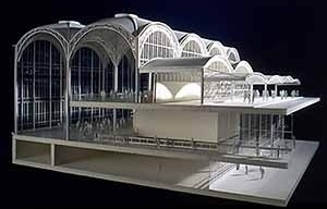
As one more consequence of the growth of the city and the suburbanization process, the WNA is functionally considered an adjunct to downtown Washington D.C. The WNA situation required for its renovation an adaptative and selective use-form that demanded different phases, ranging from the project's conception in 1992, to the construction of temporary facilities, to its finalization in 1997. The terminal, the 25th-busiest U.S. airport, served 15.5 million passengers in 1995, and was rebuilt while serving 45,000 people a day. Operated by the Metropolitan Washington Airports Authority (8). The new 1-million square feet, glossy, airy terminal stretched a quarter-mile from one end to the other and presented three levels:
1. The top, ticketing level where passengers can be dropped off by automobiles via a 5-lane, upper level roadway, protected from the weather by a high glass canopy. The ticket counters and the other functional elements are on the west wall of the building at this level;
2. The middle, concourse level, where a commercial "main street" of the building depicts an airy, luminous, and memorable place (9);
3. The lower level, baggage claim with 12 carrousels in an open circulation space.
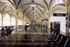
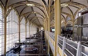
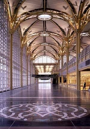
The airport was built to draw people who come from public transportation, and a short-pier design to the gates puts an end to the traveller's common feeling of walking forever. Passengers in the terminal move among the three levels via staircases, 26 escalators, and 32 elevators. Rising from the terminal building is a new airport traffic control tower, 210 feet above grade, approximately 16 stories high, which replaced the existing tower on the main terminal. The special features of the terminal design include a large wall of floor-to-ceiling window glass, a domed, vaulted ceiling above the concourse, an exposed steel structure, a terrazzo concourse floor, and an architectural enhancement program incorporating various artworks. Some of the details of these features include:
A large window on the Nation's capital
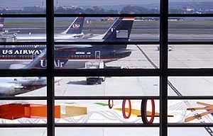
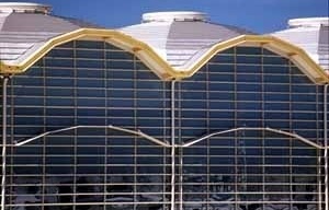
• A 58-ft high x 1,760-ft long airside "curtainwall" window glass (floor to ceiling)
• Exceptional views of the activity on the airfield and, across the Potomac, of the familiar landmarks of Washington (such as the Capitol dome and the Washington Monument).
• Clear and frittered glass for view and solar shading, with ceramic lines permanently fused into the glass to cut down glare.
A domed, vaulted ceiling above the concourse
• 54 domes, 65 feet above the concourse floor, each with a 16-ft central glass skylit oculus, within a 45-ft square repetitive structural steel bay (establishing scale, flexibility, and architectural proportions)
• The dome, one of the most ancient symbols of shelter, serve to establish a connection with the civic architecture of Washington D.C. The spatial, modular units present a recognizable human scale. The multiplicity of small spaces, each one the size of a space one can comprehend, the size of a large living room (10).
The steel structure
• Exposed steel structure of blue and yellow with white infill of sound-absorbing panels
• Yellow and white are uplifting as opposed to depressive gray from most of the airports (Shifrin 1996b)
The flooring
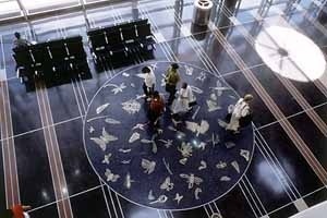
• Concourse: charcoal (almost black) terrazzo.
• 10 large round mosaic medallions of 18-ft. inlaid in the terrazzo to provide dynamic art (the sun coming through them permit a pattern of light on the floor shifting through the day).
Artworks
• 11 balustrades – primarily of porcelainized steel panels – on the ticketing level overlooking the concourse
• 5 murals – four of them at entrances to the terminal from the pedestrian bridges from the Metrorail rapid transit system
• 2 friezes on the wall of glass facing the airfield
• A large sculpture of copper aluminum and steel at the center well of the terminal
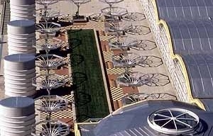
• A 1,500-sq ft trellis sculpture, made of aluminum, steel, and wood, which will help filter the sun from the windows at the southern end of the terminal on the ticketing level.
Commercial activity
• 25 food and beverage operations and almost 40 retail locations.
Through the Enhancement Program of Architecture Through Arts, the art was fully integrated with the architecture. Thirty artists from across the country were commissioned to create artworks for specific locations within the building design. The collaboration among artists, artisans, sculptors, and architects evoked a partnership that was shared in the design of public buildings in the past, such as WNA's original terminal. The American artists (young and old, male and female) came from all ethnic and artistic backgrounds (representational, figurative, and abstract schools) running the gamut from those very well-known, such as Frank Stella, to others less well-known or beginning their careers. Pelli also made sure to include a good share of Washington-area artists. Times have changed for airports. If, for a traveler, the best airport was the one a person did not particularly notice (meaning a smooth trajectory to and from the airplane to ground transportation and one’s destination), the architectural enhancement through artworks and circulation brought new intentions to the airport space. Nowadays, the best airport has to offer not only convenience but most of all a "sense of place" and a "sense of life" and excitement. The commercial activity plays an important part of the process (11). In fact, the domestic terminal of Washington, the everyday terminal, gets more "visitors" than a museum. The renovation also reminded architects that airports should also be considered – as they were at their conception – as recreation centers. Pelli sought to create in the new WNA terminal a delightful space, an airport to be seen as open, democratic, and pluralistic.
Of airports and architecture
The aging of structures such as the WNA and Dulles permitted an opportunity for an evaluation of airports and architecture. Pelli, a master of surface and a planner of large-scale developments, created at WNA memorable spaces, both intimate and grand, which, in a contemporary way, replicate the primary intentions of the original project. The 1941 art-deco terminal – which also had a picture window onto the capital – contained embellishments such as etchings in the glass panes, designs in the terrazzo floor, and carvings in the front facade. From the 1950s on, the International Style, applied to airports, was clearly anti-decorative, and architects disassociated themselves from anything having to do with superfluous embellishments. In most of the designs, form came from the needs of the structure itself, at the sacrifice of external considerations. The concern was exclusively with an inner reality that ignored the surroundings – people, sidewalks, and other components that make a city. It was a case of building to the exclusion of creating richer experiences.
In the airport, just as in the city, the prime raison d'être is the need for people to be close to one another in order to conduct their lives. Cities may seem irrational, chaotic, and disorderly, but these are characteristics that permit a number of places to become sites of spontaneous interactions. The question becomes how the architecture of airports can enhance the best of our society and de-emphasize the worst.
Airports are landmarks that carry memory and history and might permit impromptu celebrations of the life in community. For Pelli, monuments are essential, they are something to put our hearts into, an image we can share (12). According to him, one of the greatest mistakes of planners in the 20th century was to think they could create a utilitarian place that did not need monuments. The kind of monumentality they accepted resulted more from structural rhythms and functional uses than anything else. Yet, even utilitarian places need monuments. In this sense, an airport is a place for excellence, since it is a utilitarian place with a monumental quality. As an analogy, Pelli explains that: "[a] city is not made by accumulating places of work or by accumulating places of living. A city is made by the elements that are common to the citizens ... for shopping or praying or getting married – all the things that bring people together" (13).
The new WNA sought to bring concepts of embellishment, monumentality, and community life together. The terminal, in its simple architecture of wide, clear, and open spaces of glass and steel expressed the modern quality of monumentality. However, in contrast to the past, the monumentality of the structure took into consideration human proportions. Against the contemporary process of homogenization, Pelli believes that only diversity will bring back the essence of a city core. With this, he developed and used a modern language, technically homogenous, to create diversity through arts and creative play with the inner spaces.
There is no question that the technical aspects of airports have changed since the 1940s. In the 1960s, the addition of security requirements was an important area of change. Yet, since then, architects and preservationists have raised a number of questions about the nature of the alterations in airports. Might airports become the 20th-century monument par excellence to be preserved?
In the 1970s, Dulles was seriously considered for nomination to the National Register of Historic Places. Such a listing gives federal recognition to the importance of such structures and provides a review of future changes to their architectural character by the Advisory Council on Historic Preservation (14). Buildings such as the Rockfeller Center, with its 1930s murals and decoration in the lobbies; the Johnson Wax headquarters in Racine, Wisconsin; and the TWA terminal at JFK, with interiors as originally done, reflect a preserved modernism (15). These buildings, including some at airports, would be embedded with the national characteristics of the country's pragmatism, vigor, optimism, and self-assurance. The WNA, as well as the skyscrapers presently rising in Manhattan also awaken us to these characteristics.
In the 1990s, Pelli and other architects have tried to replace the old modern ideology with new values and to find an architectural style that would concentrate less on equalization of elements and more on human concerns. In this free-to-experiment phase, pre-fabs have become a dead issue, and the eclectic mixture of colors, forms, and allied elements have taken off. The Washington National Airport assumes its identity and character through the creative orchestration of Cesar Pelli. Finally, WNA can be considered a vital civic center, and it becomes a lesson, reflecting the tale of a building type and its trajectory in this century. It speaks to a new phase in architecture and its fundamental relation to the urban fabric.
Congratulation
Janet Kagan e Mig Halpine (Cesar Pelli & Associates Inc.)
notes
1
The full formal name of the airport is Ronald Reagan Washington National Airport. For the purposes of this essay, I retain the simpler original name and its acronym.
2
From the $US 6 billion to be spent by the Federal government in the U.S. for airport construction, $US2 billion were designated for the airports in the D.C. region, including Dulles International Airport's expansion and the renovation project for National.
3
STUART, J. "Washington National Airport" in Pencil Points. vol 21, n. 10, out. 1940, p. 603.
4
Idem, ibidem, p. 613.
5
Looking through the already mentioned 1941 Architectural Record dealing with WNA, it is interesting to note the transition from Eliel Saarinen's works to those of father and son together, where Eero's sculptural inclinations can be subtly noticed.
6
AIA Journal (Special Edition), vol 69, nov. 1986, p. 46.
7
HINE, Thomas. "A builder of our time", in: The New York Review of Books, Nova York, jun. 1991.
8
The Metropolitan Washington Airports Authority is an independent interstate agency created in 1986 by Virginia and the District of Columbia with the consent of the U.S. Congress.
9
The long concourse of the E-shaped terminal is a miniature Main Street including the Smithsonian Museum Store, the National Zoo Shop and a National Geographic store that will remind travelers that they still or already are in Washington. The eateries go beyond the usual fast-food fare including full-service and white-tablecloth restaurants.
10
Cesar Pelli in: SHIFRIN, Carole. "Washington National's Design for 21st century", in: Aviation Week and Space Technology. vol 145, n. 8, ago. 1996, p. 60.
11
On this subject see the interesting articles by Karrie Jacobs (1997) and Jennifer Steinhauer (1998). According to Jacobs, JFK Airport in New York will be building a new and fancy shopping mall in its terminal as an strategy of urban renewal.
12
Cesar Pelli sees the future of the city as an extension of the metropolis of today and envisages an urban environment with a central area of monuments, civic centers, and parks. The architect cherishes the past and pictures a city whose monuments would take over it. On this subject, see the interesting interview in Interior Design given in 1982.
13
DUNLAP, David W. "Future Metropolis", in: Omni. vol 7, out. 1984, p. 121.
14
In the 1970s, Washington Post architectural critic Wolf von Eckardt called the Dulles waiting room a "dingy crawl space" that promised "all the architectural charm of a bowling alley" (Carleton Knight Whither Dulles? Cold war ‘landmark’ p 28). The project increased from 600 ft to 1,240 ft, the size originally intended by the architect in 1996 (Cf Carole Shifrin Washington National's Design for 21st Century). It is now under a multiphase expansion project undertaken by SOM (Skidmore, Owings, and Merrill) in order to enhance the modernist design started by the late Eero Saarinen (Cf Allen Freeman Freeman SOM's Addition to Dulles International Airport Respects Eero Saarinen's ‘Modern Masterpiece’).
15
These are Cesar Pelli's favorite buildings, according to his interview in 1982 for the journal Interior Design.
about the author
Cristina Mehrtens holds degrees in architecture and anthropology from FAUUSP and UNICAMP, respectively. From 1987 to 1991, she was a professor of architecture at FAU PUC-Campinas and an architect for the Sao Paulo State Housing Agency (CDHU), for which she also studied state-subsidized housing under a fellowship in France sponsored by the Caisse des De'po^ts et Consignations in 1989.


